Basic Data Visualizations
- karaariadigital
- Feb 12, 2024
- 1 min read
Contents
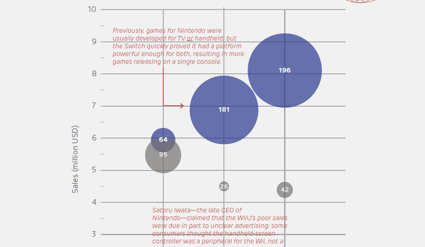
Data visualization is my favorite method of technical communication. Done right, it makes data accessible to anyone and is persuasive and fun to use. Each week was dedicated to creating a specific type of chart and implementing genre conventions.
The workflow was: gather and aggregate data, then generate the charts in Excel and export them for use in vector software. This course was my first time using Excel for data aggregation. Once confident that the data and visualization were accurate, the rest of the infographic was designed in Adobe Illustrator.
Initially, it was troubling creating a narrative with just one simple data point. While collecting and aggregating the data, it just didn’t feel like enough information. But once the data was visualized it was way easier to notice trends and interesting points to research. Additionally, peer review saved me from looking quite silly; it was a good lesson on how easy it is to skew and misrepresent data even by accident.
Below are samples from the project. Click the image to expand.